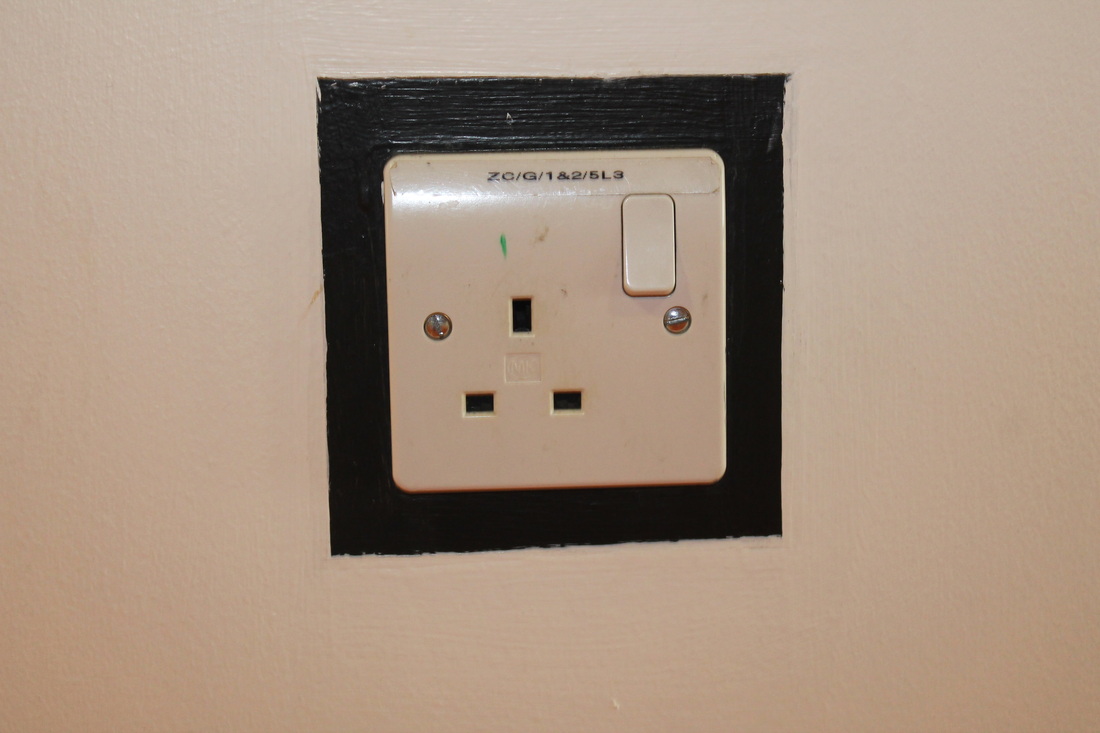
For my project I have chosen opening because it is interesting and you can take different image that represent opening. You can also get strange images through windows.
I use pinterest to help me get some ideas of what I can do.
http://www.pinterest.com/tallisarts/openings/
I use pinterest to help me get some ideas of what I can do.
http://www.pinterest.com/tallisarts/openings/
|
An artist who take images of opening is Lee Friedlander born in 1934. He began photographing in 1948 of the american social landscape. Lee Friedlander images are black and white. This makes some of his images unclear and too dark. His image composition is calm, still and organised. In some of his images Lee Friedlander much of been standing or sitting down in different places. For example the image with the person driving much of been taken in front of the car. The angles of his work are mainly straight but some are looking in a diagonal line. For example the image where he is sitting down in a car is a diagonal line because the image shows the wing mirror that is on the left. Lee Friedlander has use small angle lens to capture as much detail that it can hold. When you look at the images the whole background is closer and dense.
|
|
|
Another artist who take images of opening is Mark Garry. He was one of the artists that represented Ireland at the 2005 Venice Biennale. He takes pictures of big spaces and light that reflex of the windows. Mark Garry uses a specific range of material e.g plants, thread, bead, woodcarving and manufacture materials such as coloured contact and origami. The images that Mark Garry uses physical, visual and sensory. All of Mark Garry images are all in colour and uses a wide angle lens to put as much information as possible. All of the images background shows pure plain white to show more detail and to get more space on was Mark Garry want to take.
|
|
|
A third artist who takes images of opening is Andreas Gursky. Andreas Gursky takes large scale colour photographs of manmade and natural landscapes. His work addresses the issues of globalisation and capitalism and their affects upon society. When he first set out as a photographer, he was inspired by Becher and created small black-and-white prints. However, in the early 1980s he began using colour film and began to make a series of images of people at leisure, such as hikers, swimmers and skiers. He takes his pictures from a birds eye view e.g the Dubai picture with the islands is taken from a birds eyes view. Some of Andreas Gursky image much of been taken from different positions and angles. For example the image with the sky line of a mountain and the road much of been taken from a good view high in the sky to show the roads going up the mountain and the sky line of the mountain.
|
|
|
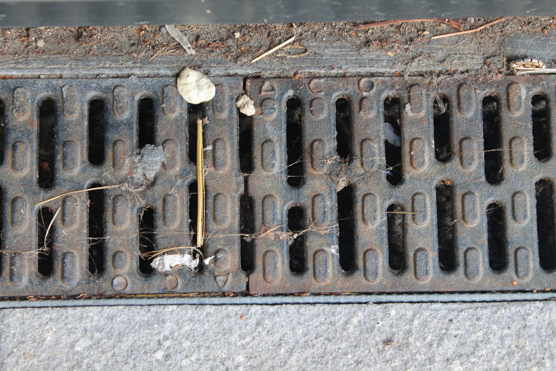
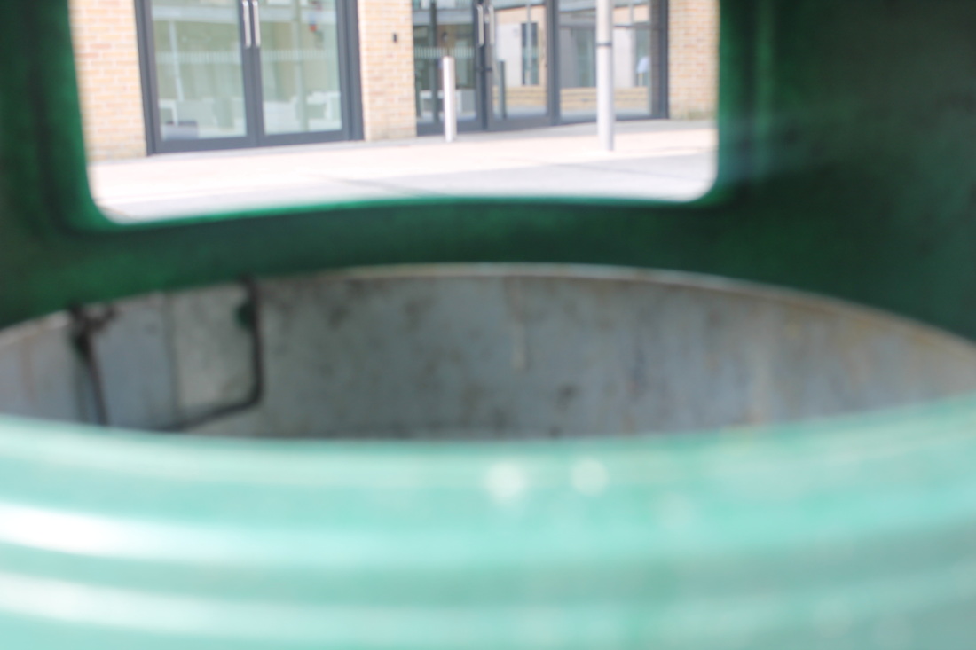
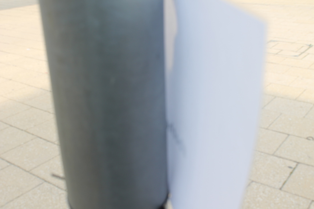
I took 30 images of opening using a iPod. The images show way of opening like doors and windows. For example in one of the images it shows two wooden poles and a sign post with the picture taken underneath. This shows the opening of the ground when you look underneath. All of the 30 images show a different way of opening by taking the pictures in a different place. Some of the images are similar to the artist that I have research. For example Mark Garry takes pictures of open place areas.
|
|
|
www
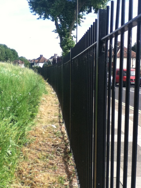
This image image went well because it shows a range of fences and shows the opening of the other side of the fence. The fence also makes it like a prison because of the line of the fences and how the photo was taken. I took this image because there not a lot of space and limited space available. The background shows houses that makes it nice on the other side of the fence and make the side that I took a image a rough place to me. |
|
|
EBI
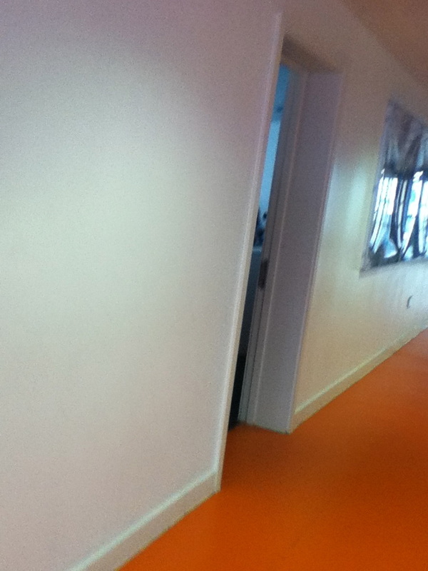
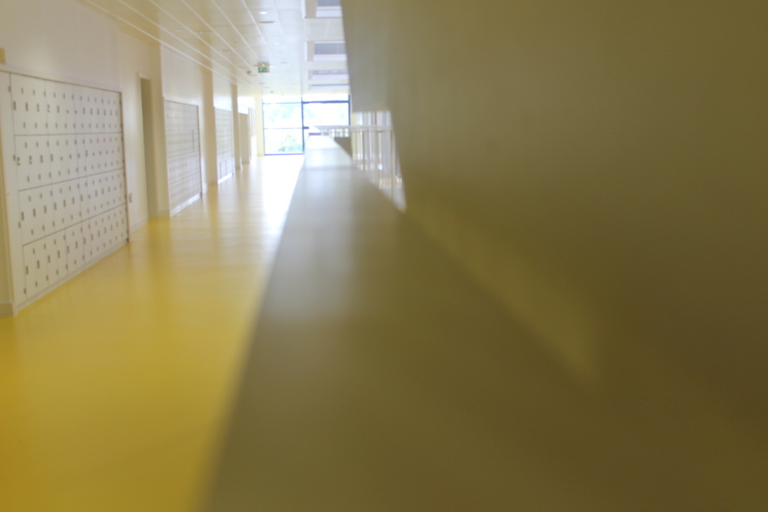
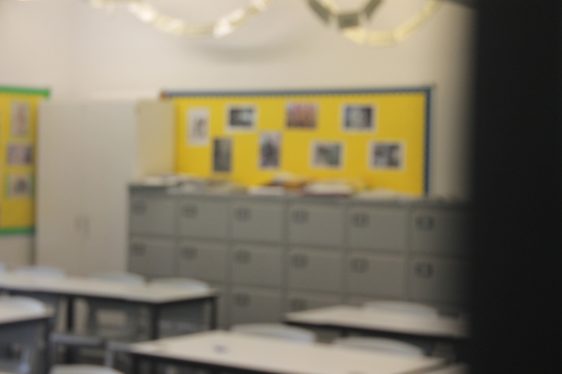
This is my least favourite because when I took the picture I took it in the wrong position and only shows a little gap between the corridor and the classroom. Next Time I will take my time finding the right position to take the photo and to not rush taking the photo. Next time I am going to use a photo edit app on a iPod to put a door on the left hand side where the door is usually put because it will look better and it will be more creative. |
|
|
|
Lee Miller is an american photographer that takes pictures of opening. She was also known to be a successful fashion model in New York in the 1920's before going to Paris. Lee Miller became a professional fashion and fine arts photographer. In the second world war Lee Miller became an war correspondent for Vogues. She covered parts of the second world war like the London Blitz's and concentration camps in Germany e.g. Buchenwald was a concentration camp that Lee Miller covered. In the late 1920's Lee Miller traveled to Paris, inspired by the surrealist artist May Ray. Here, she became his apprentice, lover and muse.
|
When I take my next set of images, I will take most pictures of things outside and some of nature.
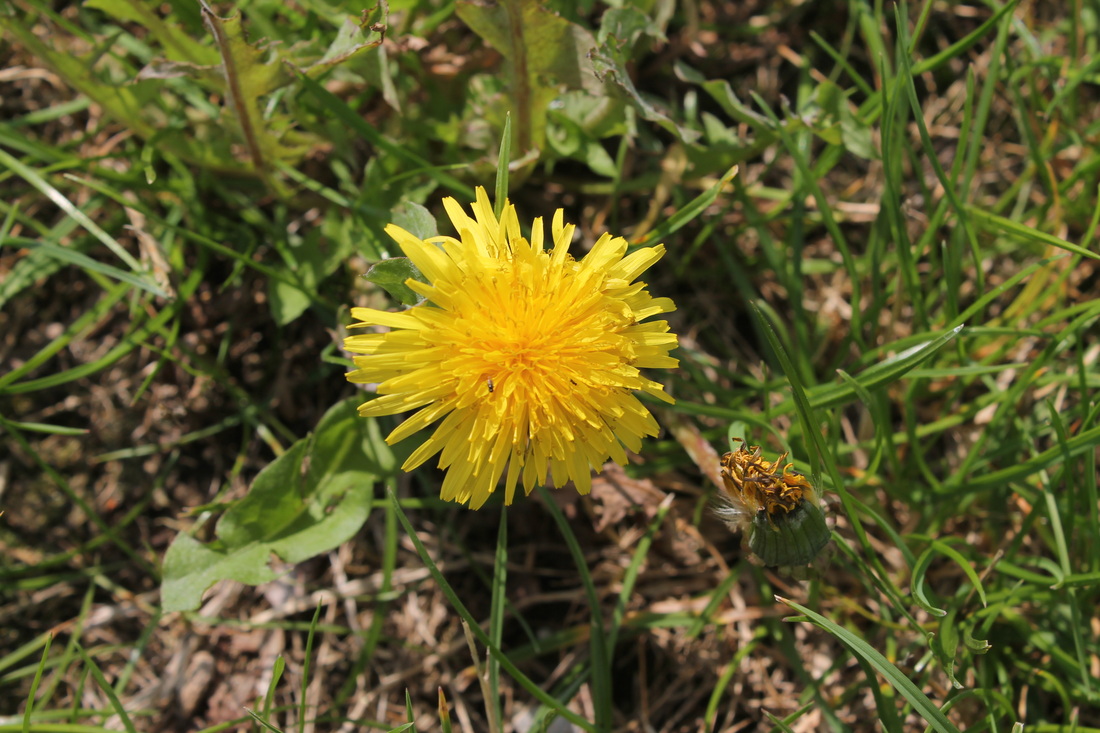
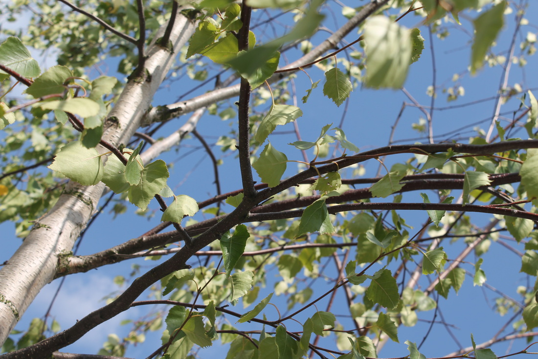
In this set of pictures I have taken a variety of pictures which open in very different ways, some do take a lot longer than others do. I use a digital camera using different angles like bird eye view, close ups and looking above. The image that went well is the one with the tree steam because it shows space between one and other and it is very detail and show clearly whats on the floor. The tree looks like the leaning tower of Pisa because of the shape of it and the positing when I took the image. All of the images are focus on one thing. For example the picture of the sunflower is strongly focus and it surrounding. I could improve these images by changing my positing on some of the images to get clear detail on what the image is focus on.
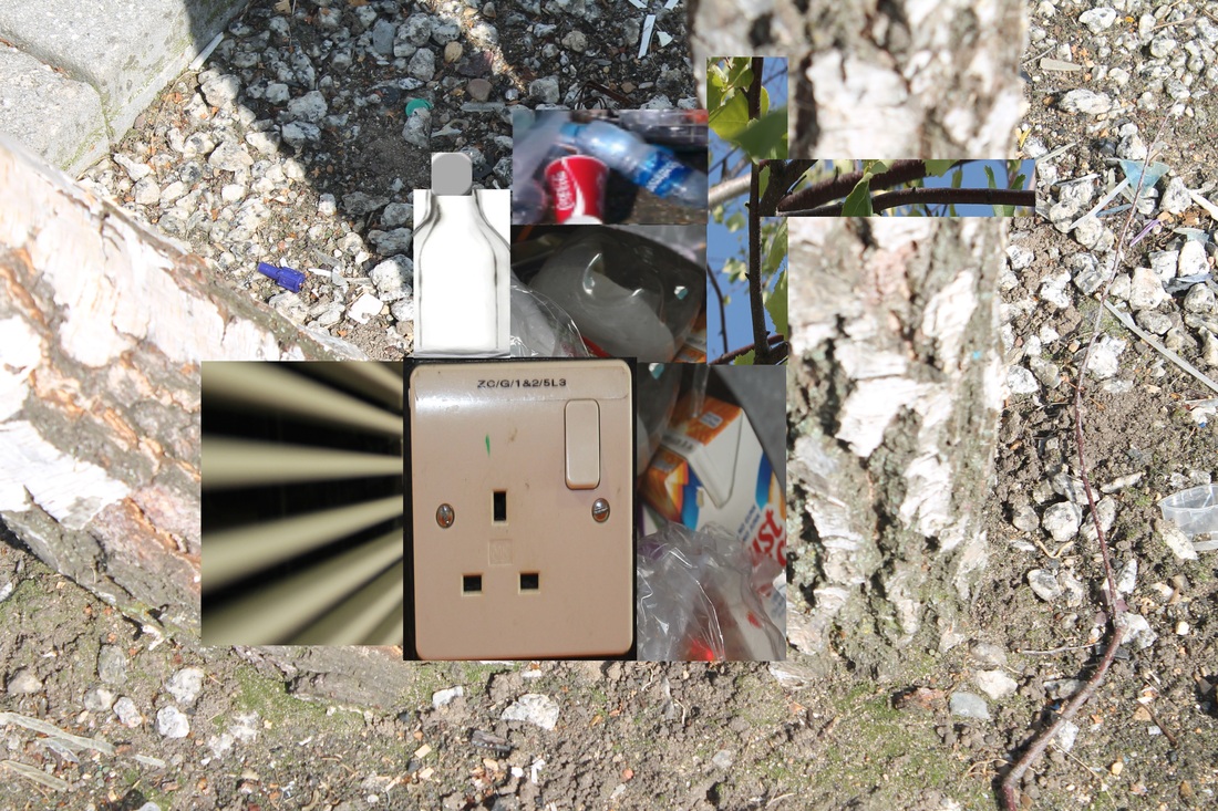
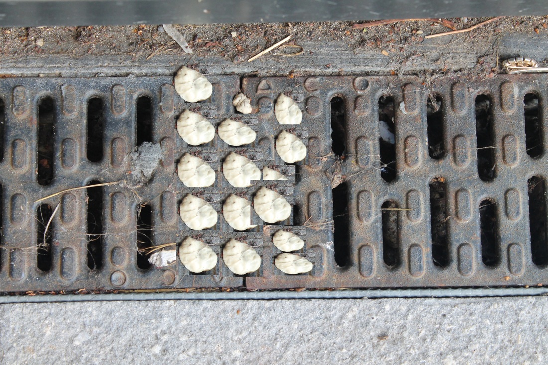
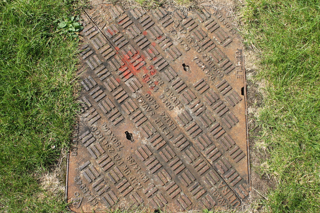
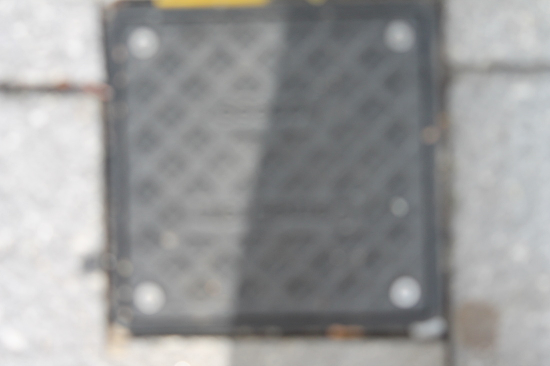
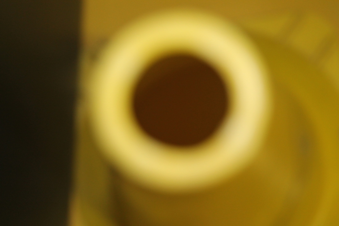
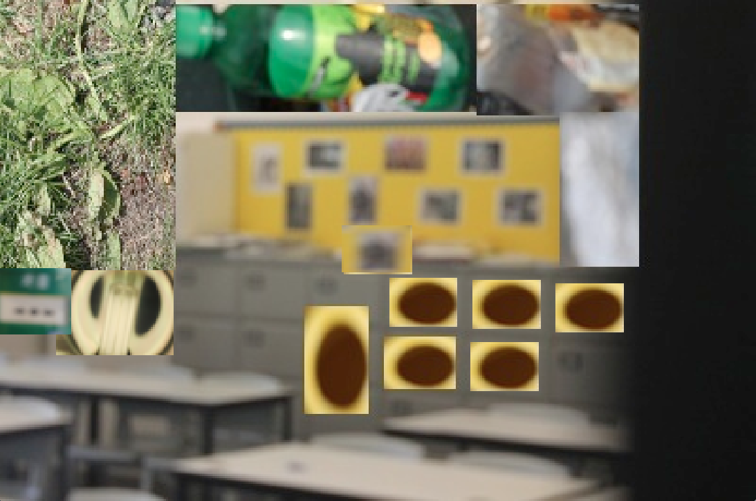
In these set of pictures I took some of my pictures from my previous set and add some more detailed to them by copying some parts of images and adding them to it. For example the sewage pipe had chewing gum on them so I decided to add more going down so it would show the chewing gums in the caps. The first image I did I decided to make the background look like litter have been dropped. I did this because it is interesting and makes the first impression of it a bad one due to the rubbish that is in the background. The third image I took I decided to put chewing gum where you open the the metal plate that leads to the sewers because it shows a different and strange way of opening. I also put grass and two sunflowers because it shows that grass have been cut when you can't see green and it joins up with the oringal grass that was there before i changed it around. I could improve these images by trying to rotate the images that I am adding to so the images will standout and be more interesting.
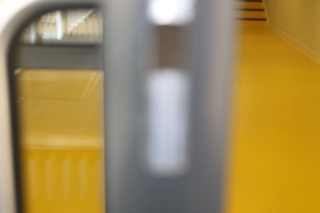
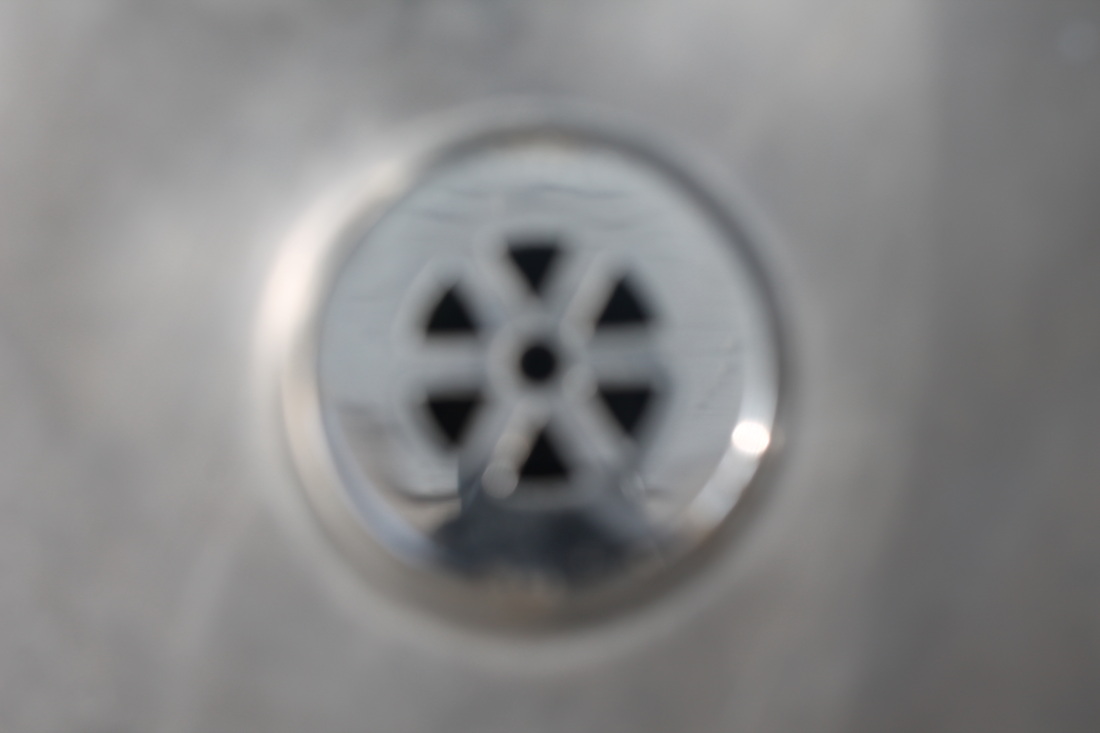
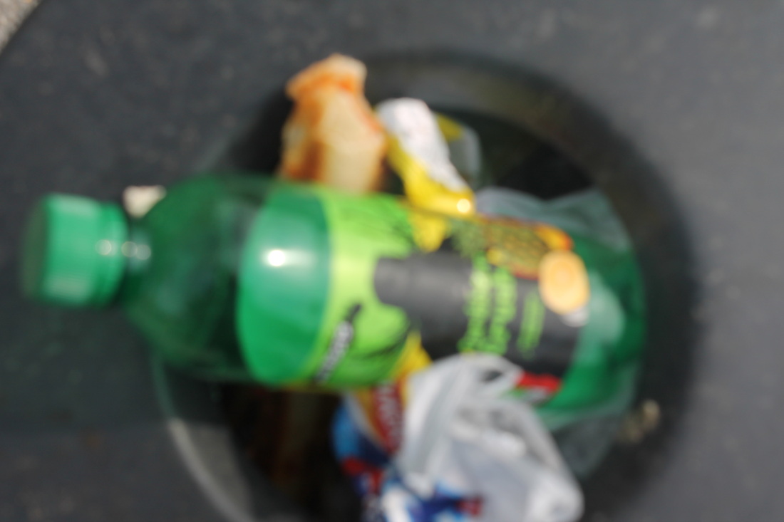
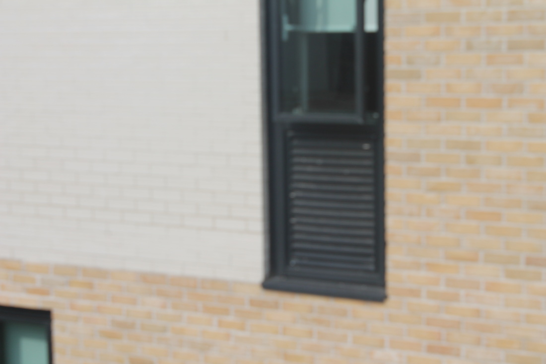
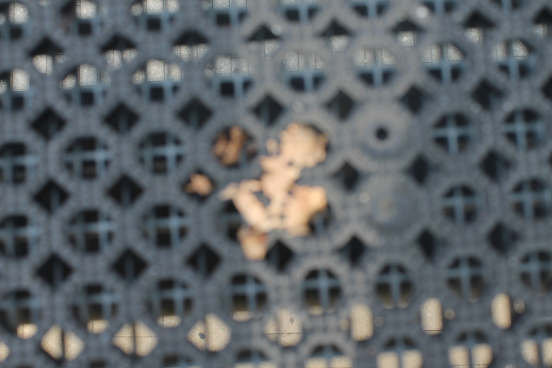
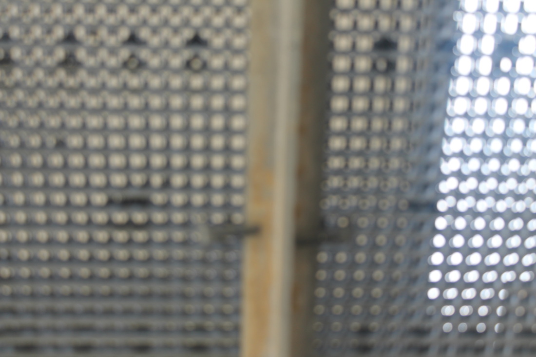
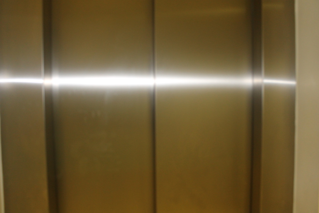
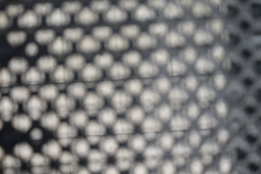
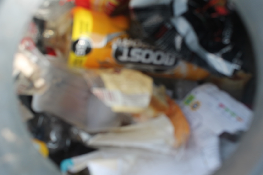
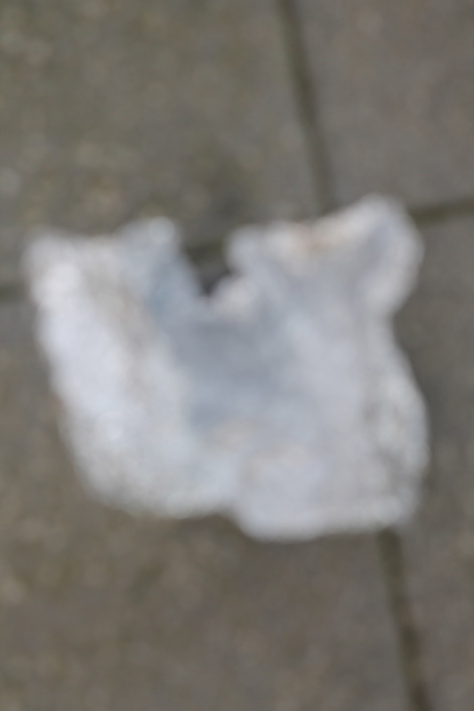
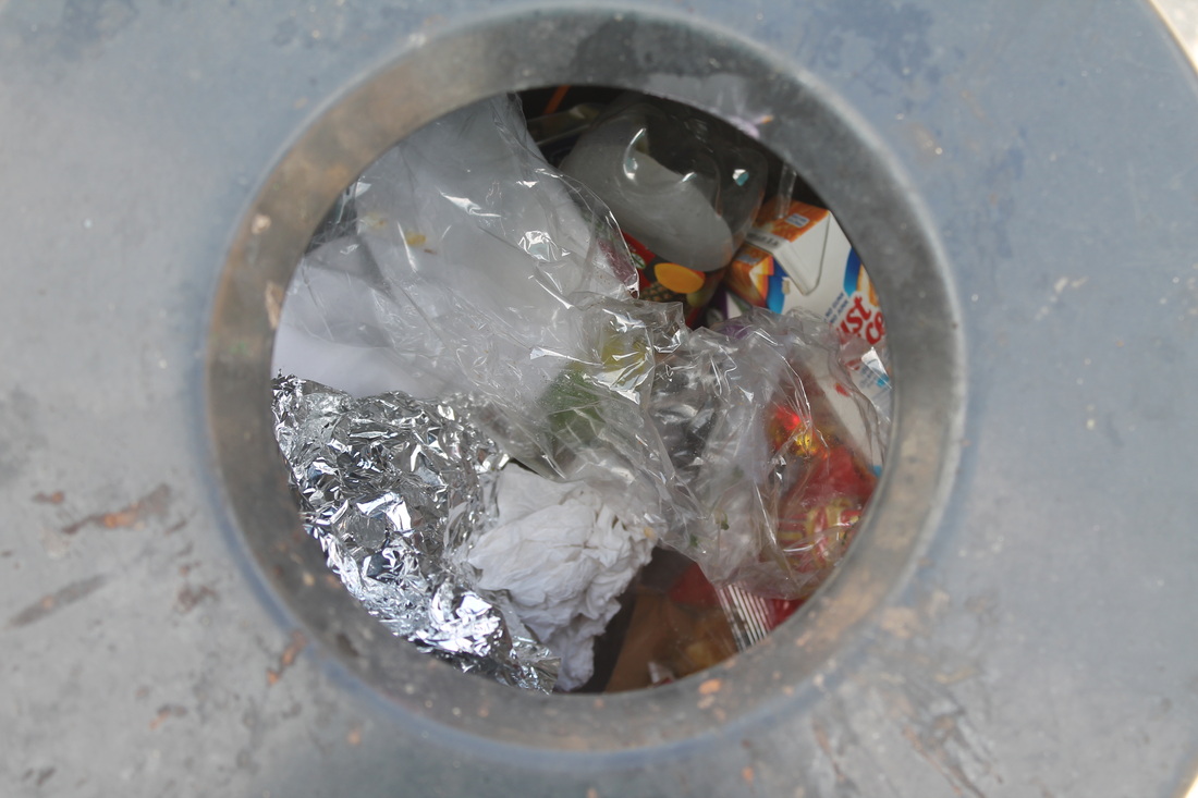
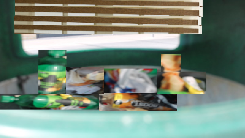
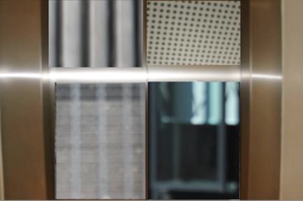
In these sets of images I took a range of different photos that represent opening. Some of the images I took will be made into chunks and put into one whole photo when I do my next set of images. For example I took images of bins with rubbish in it because it is an opening of what is inside it and some of the rubbish will be cropped into another image when I do my next set of images. The image that went well was the lift in yellow block because it shows a different way of opening into or out of the building and it also shows the reflection of the light which appears as if the lift doors are splitting open. I could improve these images by focusing the camera better by adjusting the setting before I take the image. For example the picture with the foil on the floor wasn't in focus and it is also blurred because the camera wasn't in focus. I could also improve the last two images of the air vents because it doesn't look clear and it is very dark. I will improve these last two images by zooming out the lens of the camera to show the air vent and some of the inside of the air vent. All the images are in colour because it shows light of the openings more clearly. I used a range of viewpoints depending on the subject for example I used a long shot of the classroom to show the whole setting, I used close up for the rubbish bin and I used a low angle shot for the table tennis table to give the impression of size and importances.
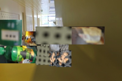
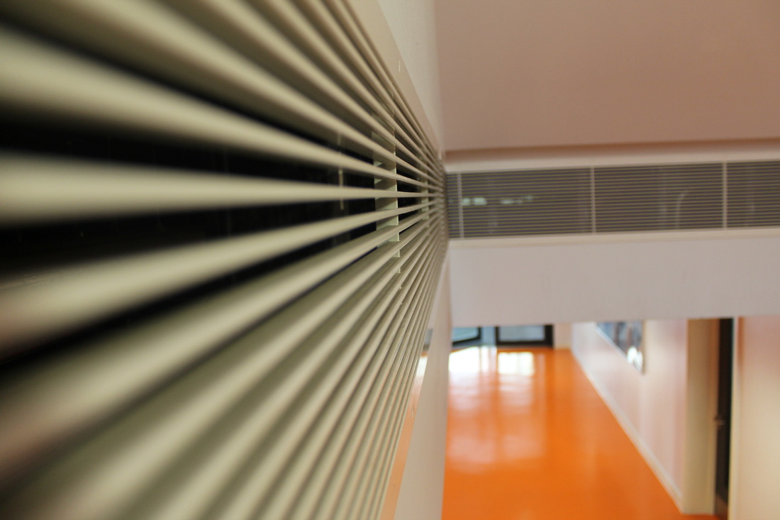
I created these composition images using all my own images from my photographs. As the background I used full size photographs and super imposed sections of other photographs of different sizes which then closed up some of the original opening for example in the first composition I have closed the corridor windows with openings of bottle opening, ceiling vents and various grill and grid openings. I was pleased with the results because by doing this I have created something new using images that are still openings which I have been creative with to create a unique composition. I did this because by using my own images of openings and putting them in to one I have created even more openings. I had three attempts at this task. It would be even better if I made the final composition less busy and used fewer images to make my point. I could use my best images of clearer openings to open up the background photograph even more to clearly show the theme of opening.
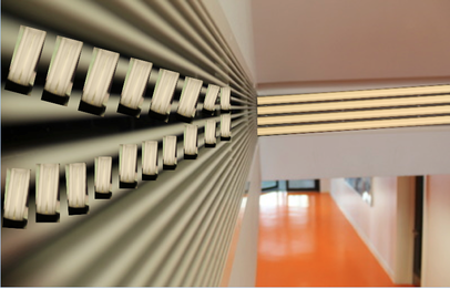
This is my final and favourite composition. I have used my best photograph of the lift doors which look like they are splitting open horizontally with the natural effect of the sunlight reflection. The lift doors were closed so I have used 4 other images of openings from my own original photo gallery to open up each section of the lift doors creating even more light to come through and even more openings. I think this composition is very clear and shows my theme of "openings" dramatically
Lorenzo Vitturi
|
|
Lorenzo Vitturi was a local resident in Dalston. As a resident he saw the community, economy and the the very make up of the street market. He began by making sculptures in his studio from objects found in the market like fruits, vegetables and fabrics. Some objects were left on the street to throw away or rot. His objects were arranged into different compositions. All of the objects he uses represent the market at Dalston.
|
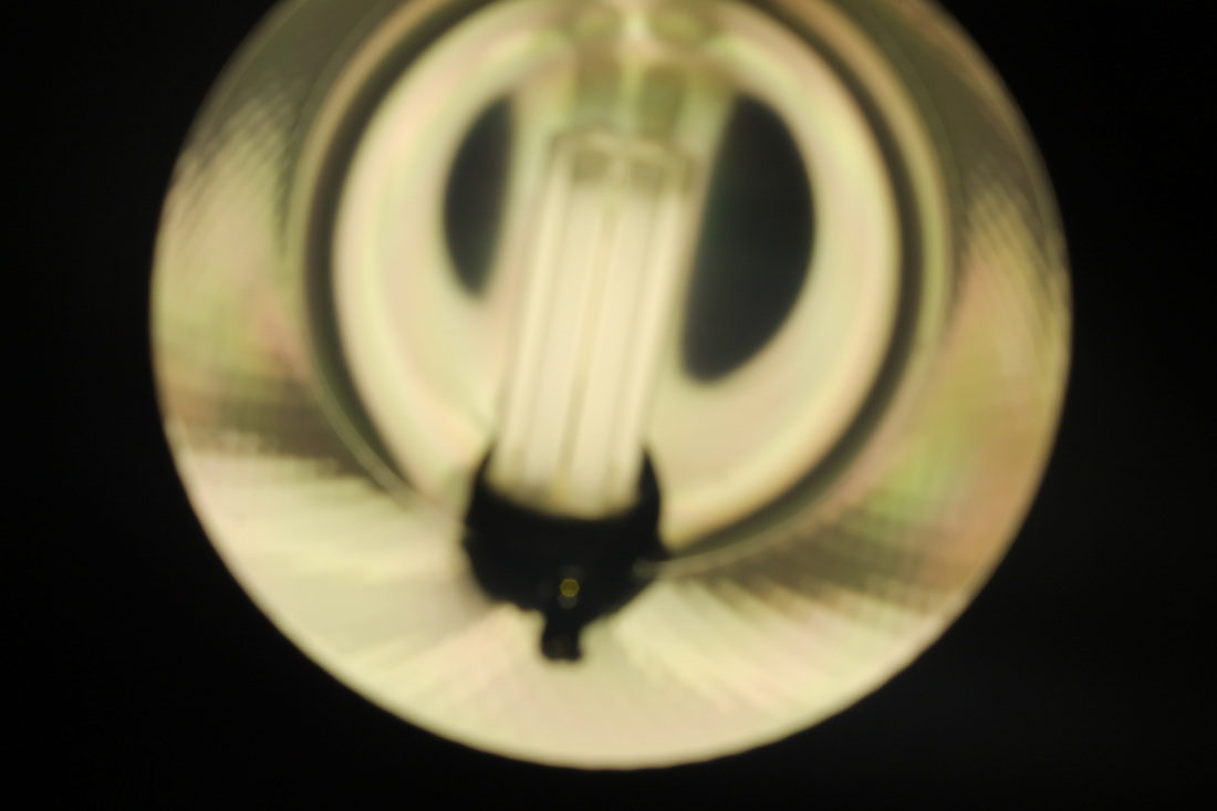
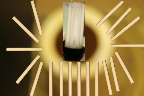
This images shows different ways of openings because of the vents. I decided to put light bulbs onto the image because it will make the picture more interesting and different.I am also putting light into the dark to show light coming out of the vents. I decided to put the small light bulbs at the front of the image because they are small and they fit in the front of the vents perfectly. I copied the image onto Microsoft word because when I put other objects in the image I can rotate then easier and I can move the objects if they don't fit when I am finishing the image. I decided to put the large light bulbs at the back of the images because the vents were bigger than at the front and the bulb was big and fitted nicely at the back.
|
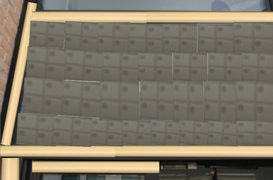
This image shows different ways of opening by putting filing cabinets in the middle of the image. I decided to do this because I had a lot of space to try things and the filing cabinet was the best fit. I also put fluorescent bulbs around the edges of the image because it makes it stand out and more interesting to have it brighter than darker. I used Microsoft Word because when I put my original images to the experiment it is easy to move things and delete things and let me try new things out.
|
|
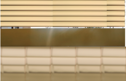
This image shows different ways of opening by putting other objects in and putting it in my original picture. I decided to put thin fluorescent bulbs because then they went thinner they look like chop sticks. I also decided to put a light bulb in the image because they space where I put the bulb looks like a bulb screw hole that when you put a bulb there is screws on and stays. I also decided to put the bulb in the middle of the image because I wanted to make the image like a lamp. I did this by using Microsoft Word because I could rotate and move the objects in the image and this help me because if I did something wrong I could delete it and didn't have to restart it.
|
|
This image show different ways of opening by putting other images of objects in and putting it on to my original image. I decided to put a thick light bulbs because they fitted the angle of my image because my original image was a table tennis and lay the camera facing the net and it allows me to put the bulbs where I wanted to put them. I also decided to put fluorescent bulbs at the top of the image because I wanted to have little light show and have a reflection of the light show on the net. I done this by using Microsoft Word because I needed to rotate the images of the objects and make them smaller.
|
My experiment went well because all of images I have done were good. The image that went well was the one with the table tennis because it looks better and the composition of the image is good and better. The artist that the images are based on is Lee Miller but with some change. What went well was that all of the images were all in the right position and shows a lot of detail about openings. I could improve by being more creative and adding more detail to the image.
The natural world
http://www.pinterest.com/tallisarts/the-natural-world/
I have chosen the natural world because it is interesting and have an variety of thing to take photos of like leaves, water, lakes, trees, the sky, etc plus other things. I have found three artists (photographers) on Pinterest that work with the natural world and will be looking at each of their work in this project. The photographers I have chosen are Ryan Halliwell, Letha Wilson and Jason De Morte. I will look at each of their work in depth for inspiration to help decide on my final piece.
Ryan Halliwill
|
Ryan Halliwill is an photographer who is currently living in New York getting his BFA in Photography at School of Visual Arts. His images that he has taken are all well composed and are all organised. In some of his images he has taken an image and cropped another image onto it and, he has to position it perfectly. Some of his images are black and white and some are dark but mainly all his images are in colour. All of his image are represented of the natural world and are shown in different ways.
|
|
Jason DeMarte
|
Jason DeMarte is a photographer with a BFA (bachelor of fine arts) in photography. His work has been exhibited in museums and galleries. He uses digital adjustments to put something modern into a natural scene. Some of his images look embedded into a natural scene. For example he has a bright pink deer in the woods and has a lump of steak, donuts and crisp. He did this by using digital adjustment.
|
|
Helen Birch
|
Helen Birch is a photographer who has studied a lot of art qualifications. Some of her images all represent the natural world and she has taken photographs of a natural scenery and then distorted them in some way. She has done this by either folding her photographs, changing the image or removing sections. She has also placed man made materials in the middle of her scenes, for example, a pillar in the middle of a picture or a canvas in the middle of a tree.
|
|
|
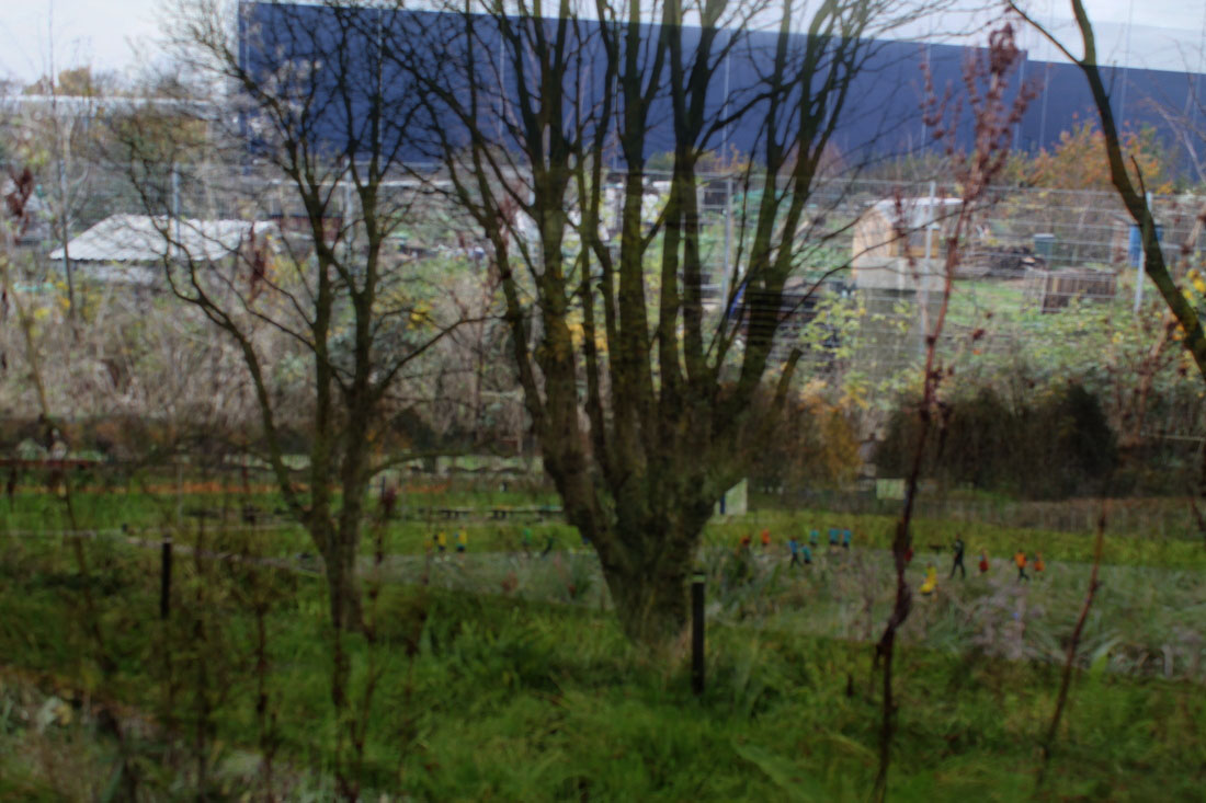
These set of images are my first experiment for my theme. All of the images I took represent the natural world which is the theme I am doing. All of the images are in colour but some of the images are dark and have shadows in them. For example the image with the small bush have a shadow in it and it is also dark in the image but shows a tiny bit of light. Two of the images shows pigeons moving and hunting for food. I did this because it shows how animals live in the natural world. The image that went well was the one with small grass in the mutt because it shows a pattern and shows the grass growing and dyeing and it also shows a shape. The image that didn't go well was the one with stick with three branches because it doesn't show a lot about the natural world and it is plain and empty in the background.
|
|
|
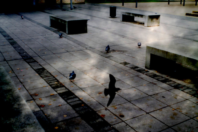
These set of images are my second experiment for my theme. All of my images I took represent the natural world which is the theme I am doing. All of my images are in colour but some of my images are blurred because of the distance where I took the images. I took seventeen set of images of pigeons and seagulls. This is part of the natural world and the images show how they live and get food. Some of my images show the main road and reality in the background. The one that went well was the one with the wall and the row of trees in the background because it very cleared and detailed and you can see what the image represent very clearly. The one that I could improve on is the one with a group of pigeons fighting because it blurred and you can't see clearly what is going on in the image and what in it.
|
|
|
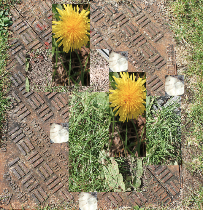
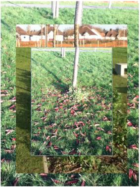
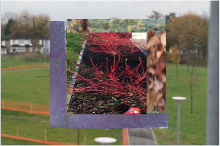
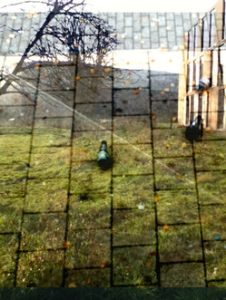
This is my first completed experiment of representing the natural world. This image is similar to the photographer Ryan Halliwill because he has put another image on top of another and shows the middle of the main image with the bottom of the tree and have a small tree round it and have leafs on the ground. In the image there is a small picture of trees in a diagonal line and houses in the background. This make the tree in the image bigger and been put into another place and moved from where I took the image of the tree. This image also show new features to the image with is underneath the rectangle shape made out of pictures.
|
|
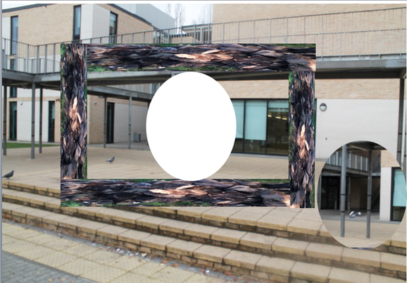
This is my second completed experiment of representing the natural world. This image is similar to the photographer Ryan Halliwill because he has put another image on top of another and shows
|
|
For this particular experiment I used Photoshop and experimented with using the marquee and lasso tool in order to cut out shapes easier, I found this easy to do and it makes the image more interesting.
|
|
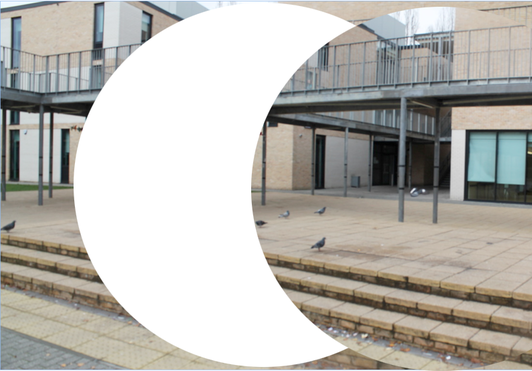
This is my second image I used photoshop and experimented with the lasso tool in order to cut out shapes easier. This was easy to do because all I had to do was decide how big I want the shape.
|
|
|
|
